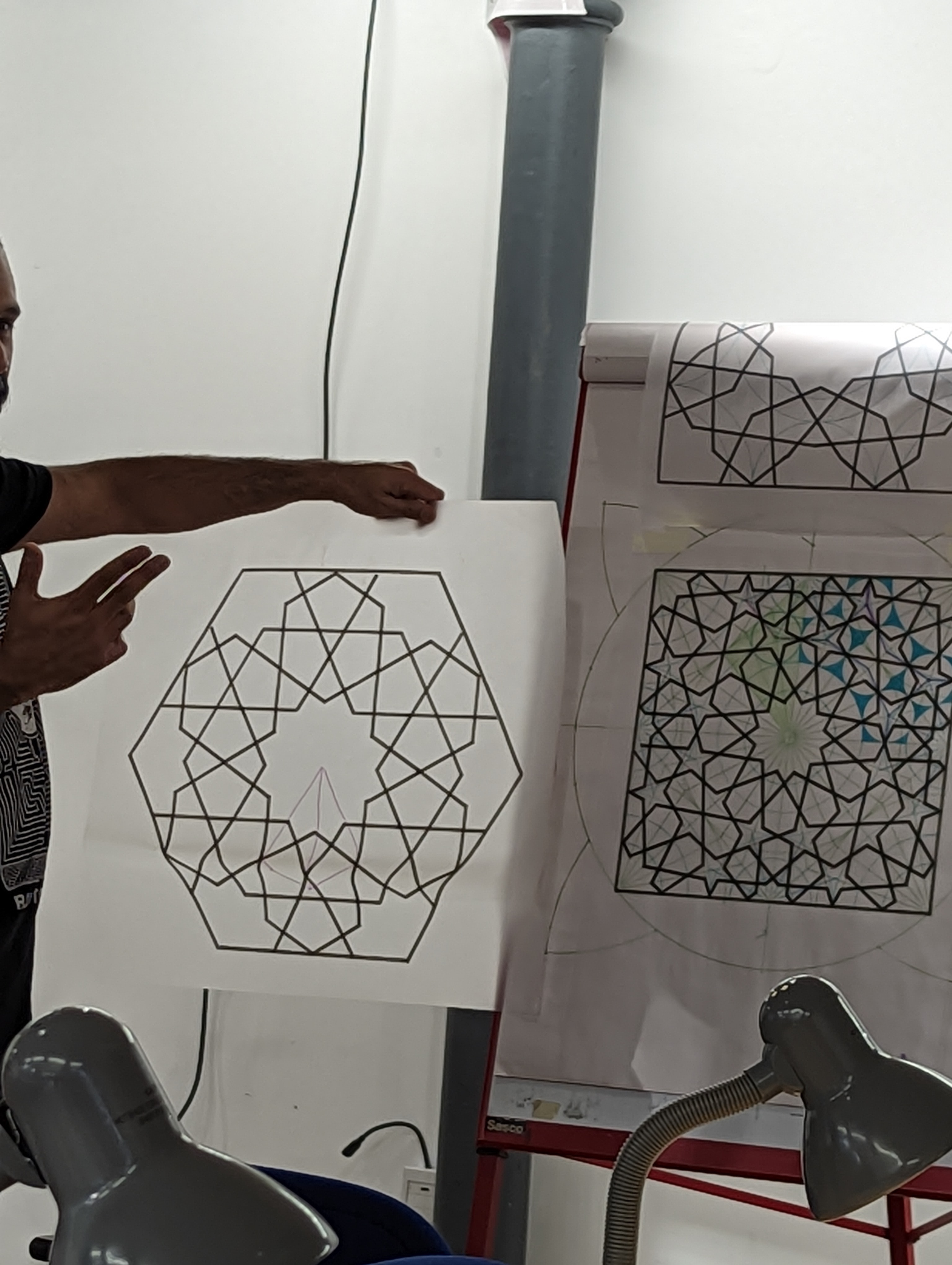
A five-day course at Princes School of Traditional Arts, tutor Ameet Hindocha, who aimed to teach us how to look at the pattern and see what's going on, rather than give us instructions to follow. He demonstrated the construction of 12 patterns, and guided us through combining two into "our own" pattern, and gave us handouts for them all.
I'll start with "my own" pattern, which looks unfunished - that's deliberate. The finished section can be "rubbed off" onto watercolour paper and painted, and the unfinished section (at top) shows some basic structure.
However the main structure is on the sheet underneath, and it's derived from a design exercise using square and triangular tiles, with sides of the same length so they can be combined. My own design is utterly useless for this (too much white space!) but I enjoyed seeing how different shapes of white space emerged
Here's another that I got to a "finished" state -
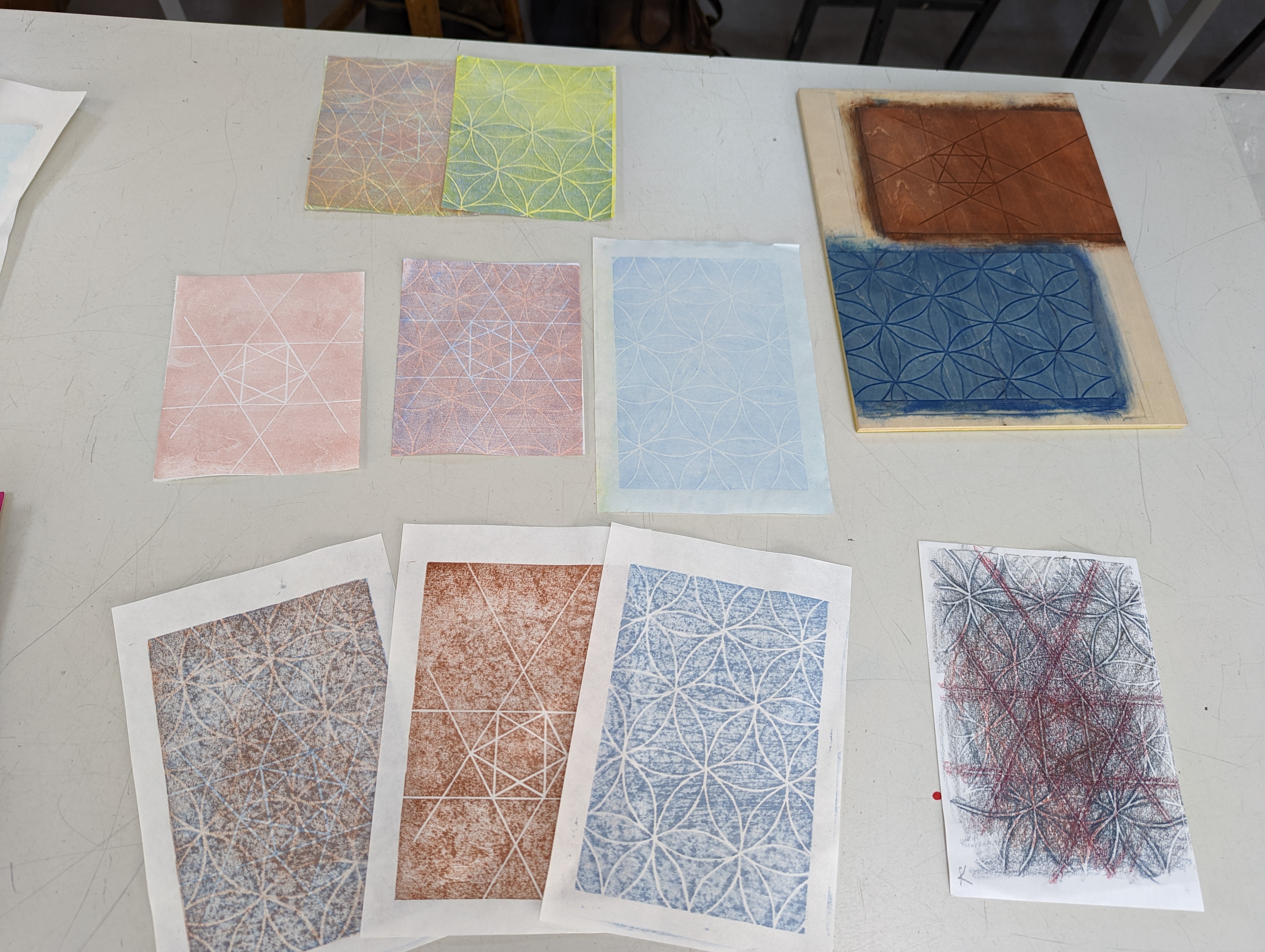
Over the five days, time, effort, and concentration produced at least 12 patterns. The square versions laid out for overview -
First and last patterns, hexagonal and square format -
Short slide shows summed up key concepts -
I was sitting a long way from the ongoing demonstation and had to zoom the phone camera to the max to see what was going on. It didn't help that the green used for construction lines wasn't high contrast (sometimes a pale blue was used as well, indistinguishable to me), and when small-scale operations were carried out ("draw the next line from here to here") I was totally lost. But eventually all became clear, and I benefited from quite a few one-to-one instructions.
If you think this looks complicated - it is!
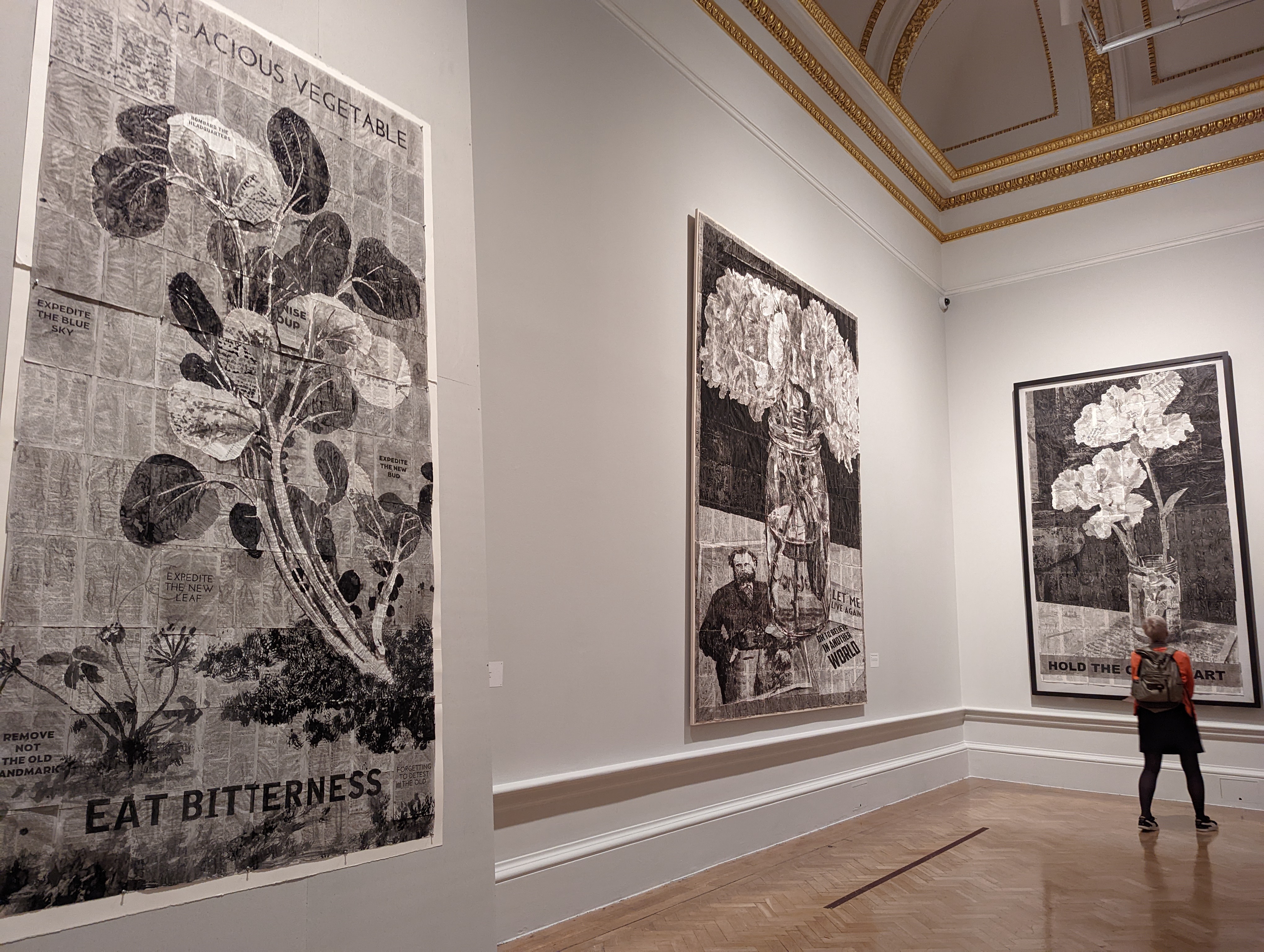
Several finished works were dotted around the room - beautiful work -
I itched to do some painting, however simple, and on the weekend I traced some sections of pattern, transferred them to strips of leftover paper, and tried out a few colourways -