Getting the photos to look like the original painting isn't easy, and green seems to give the camera a lot of problems.
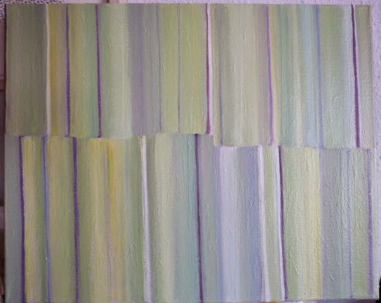 |
| As it came out of the camera - cropped |
After cropping, it needs adjusting it to fit into the rectangle (the keystrokes - on a PC, using Photoshop - are Ctl+A to Select All, then Ctl+T to transform, and holding down the Control key while dragging out the corners). Then the colour adjustment can start. Some people use Curves but I'm sticking with what I know, which is Levels (Ctl+L).
First, "tightening" by moving the little triangles to the point where the histogram starts -
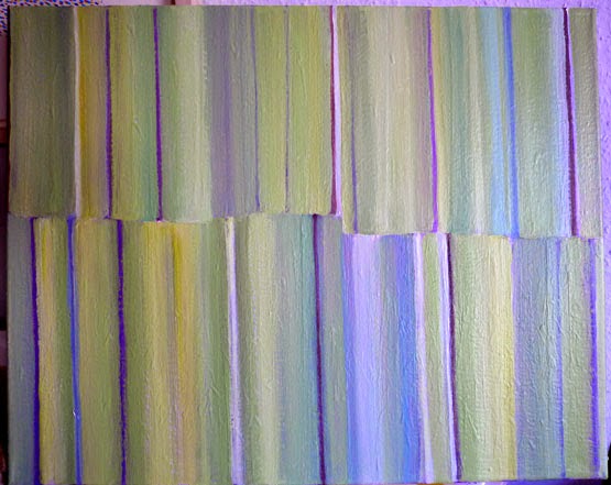 |
| Without "empty pixels" |
To adjust for lighting conditions, hold down the Control and Alt keys and hit the B key -
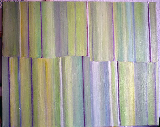 |
| Adjusted for lighting |
Then I go back to Levels (Ctl+L) and choose individual colours, in this case Green, and move the sliders till the colours look like the painting, which is propped beside the computer.
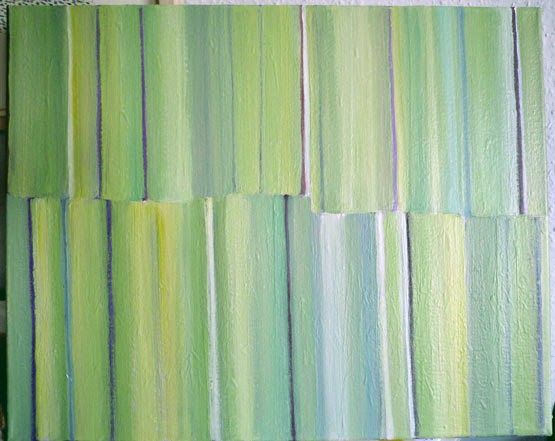 |
| Individual colours adjusted in Levels |
On my screen at least ("your milage may vary") it pretty much matches the original ... and is certainly a far cry from what came out of the camera.
No comments:
Post a Comment